The story / 2025–26 / First Point / In-house
First Point
An identity built to be someone’s first point of care.
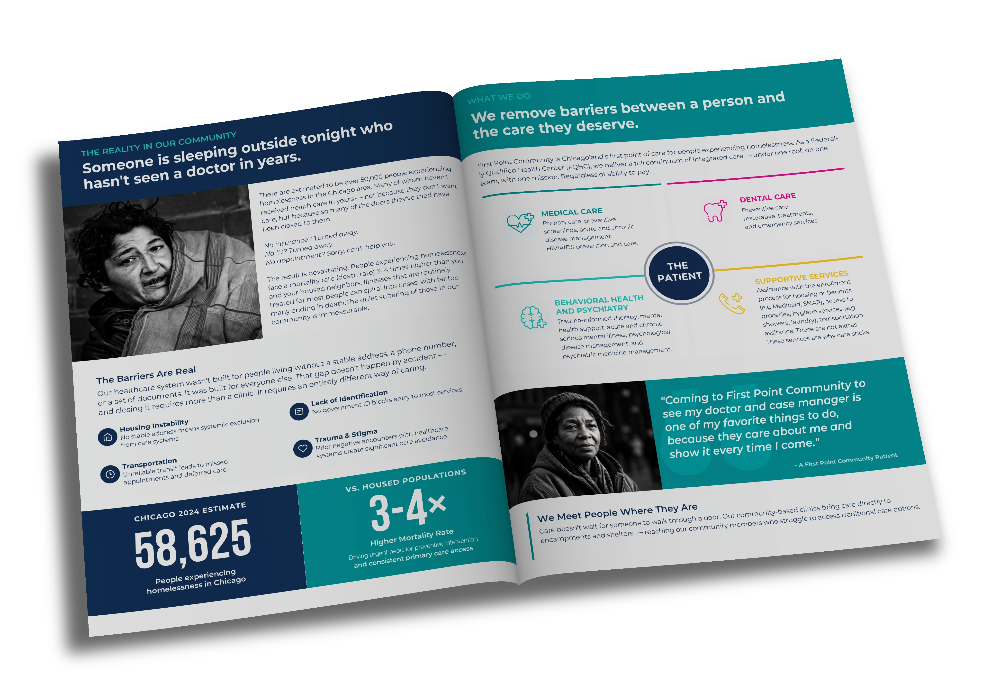
Community / Donor brochure
The story / 2025–26 / First Point / In-house
An identity built to be someone’s first point of care.
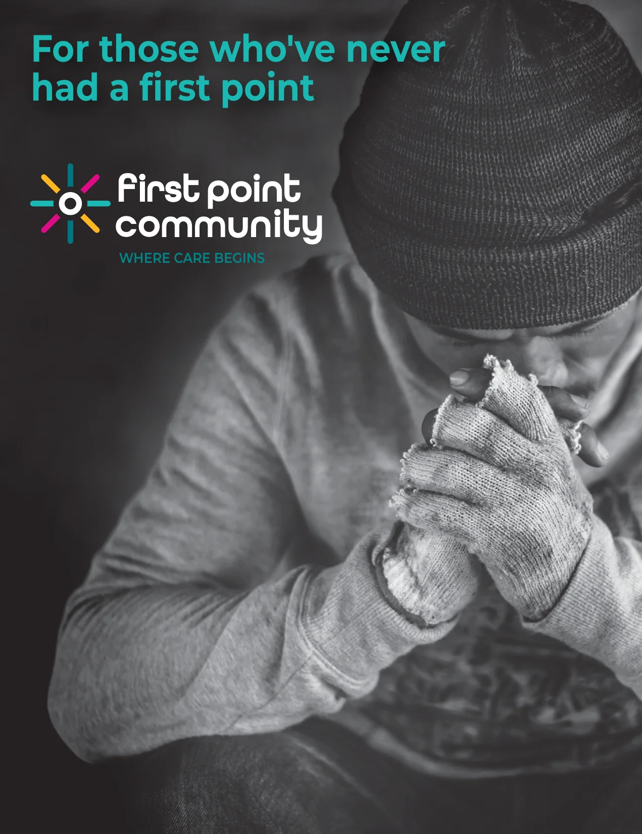
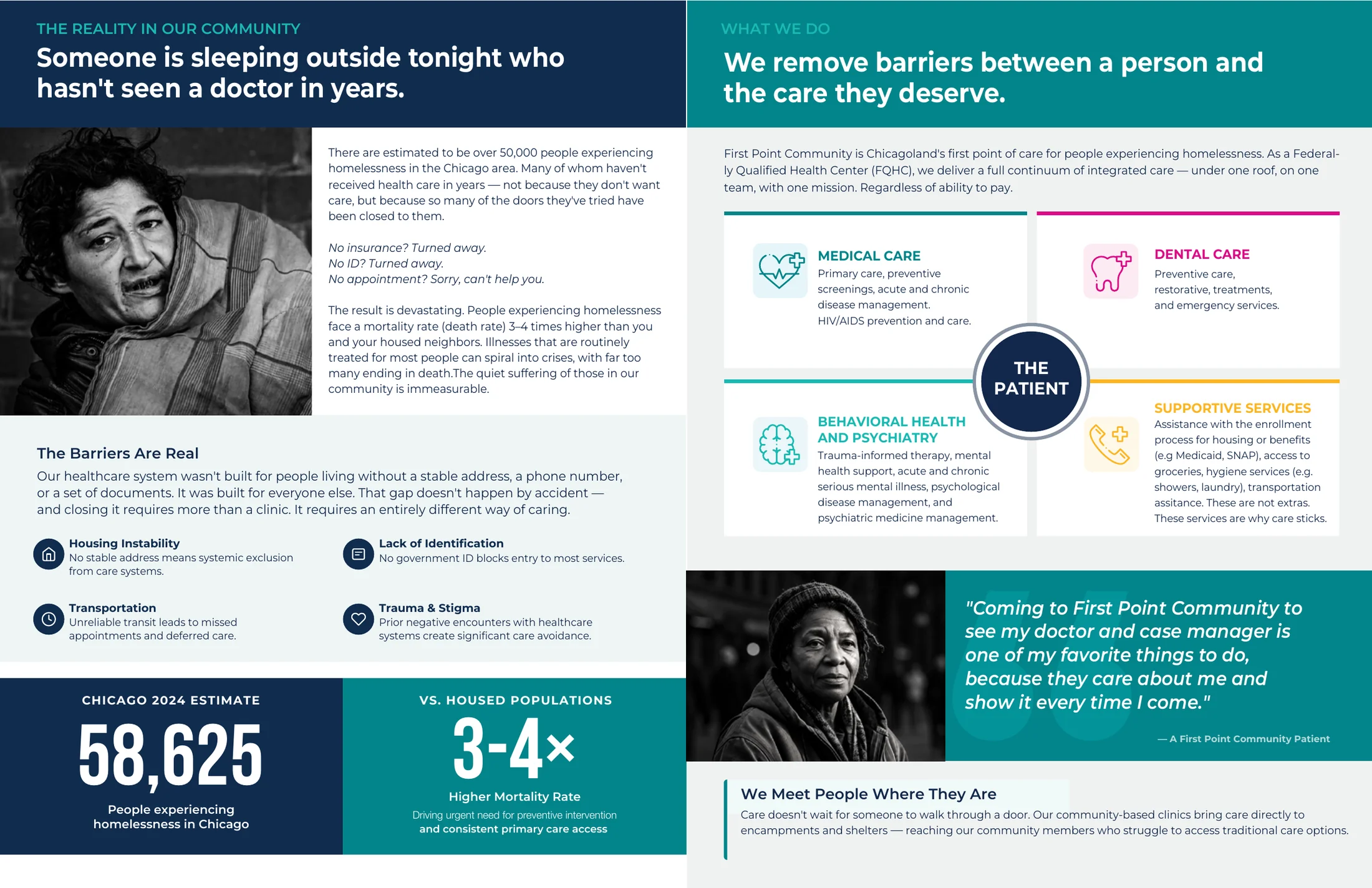
Community / Donor brochure
First Point had to speak to two people at once: a doctor deciding who to trust with a practice, and a patient deciding whether to walk through the door.
Finding the mark
Every direction had to answer one question: does this look like a partner, or a buyer?
I worked through more than a hundred versions of form, color and type. These are the turns that mattered.























The mark
Joined, not absorbed.
Independent points meeting at a center that stays open. Part of something bigger without disappearing into it.
The wordmark is rounded and lowercase. Nothing about it looks like a holding company.
The family
One mark, every name.
The burst stays whole for every name, so each new part of the organization joins something people already recognize.

In use
Two audiences, one voice.
Partners speaks to physicians and health center leaders. Community speaks to patients and neighbors. Same mark, same palette, a different conversation.
For physicians and health centers
For patients and neighbors
Online
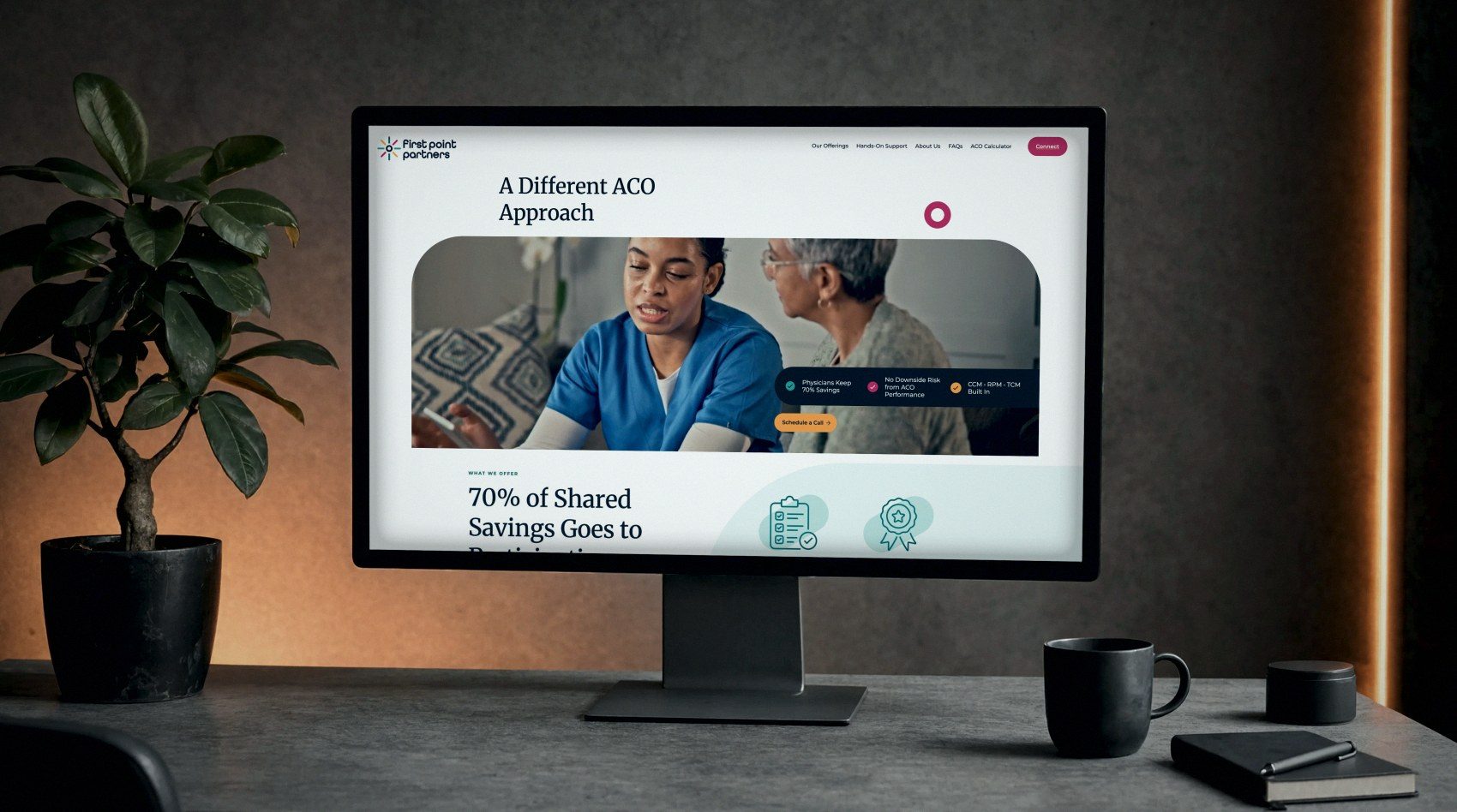
The same voice, on screen.
I art directed the website so it carried the same mark, color and warmth as everything else. Clique Studios designed and built it.
From brief to an approved mark in under three weeks, and a system built for every name that comes next.
ClientFirst Point Partners and First Point Community
WhereIn-house, One Health Partners
My roleIdentity, logo system and launch materials, from first sketches through print. Art direction for the website; design and development by Clique Studios.