The story / 2014 / Merck / at Continuum Clinical
Keynote
The identity for the trial program behind the world’s best-selling medicine.

In 2014, immunotherapy was still new, and Merck had one investigational drug about to be studied across multiple cancers. We were brought in to give the research one identity that could grow with the program.
The mark
A power already inside.
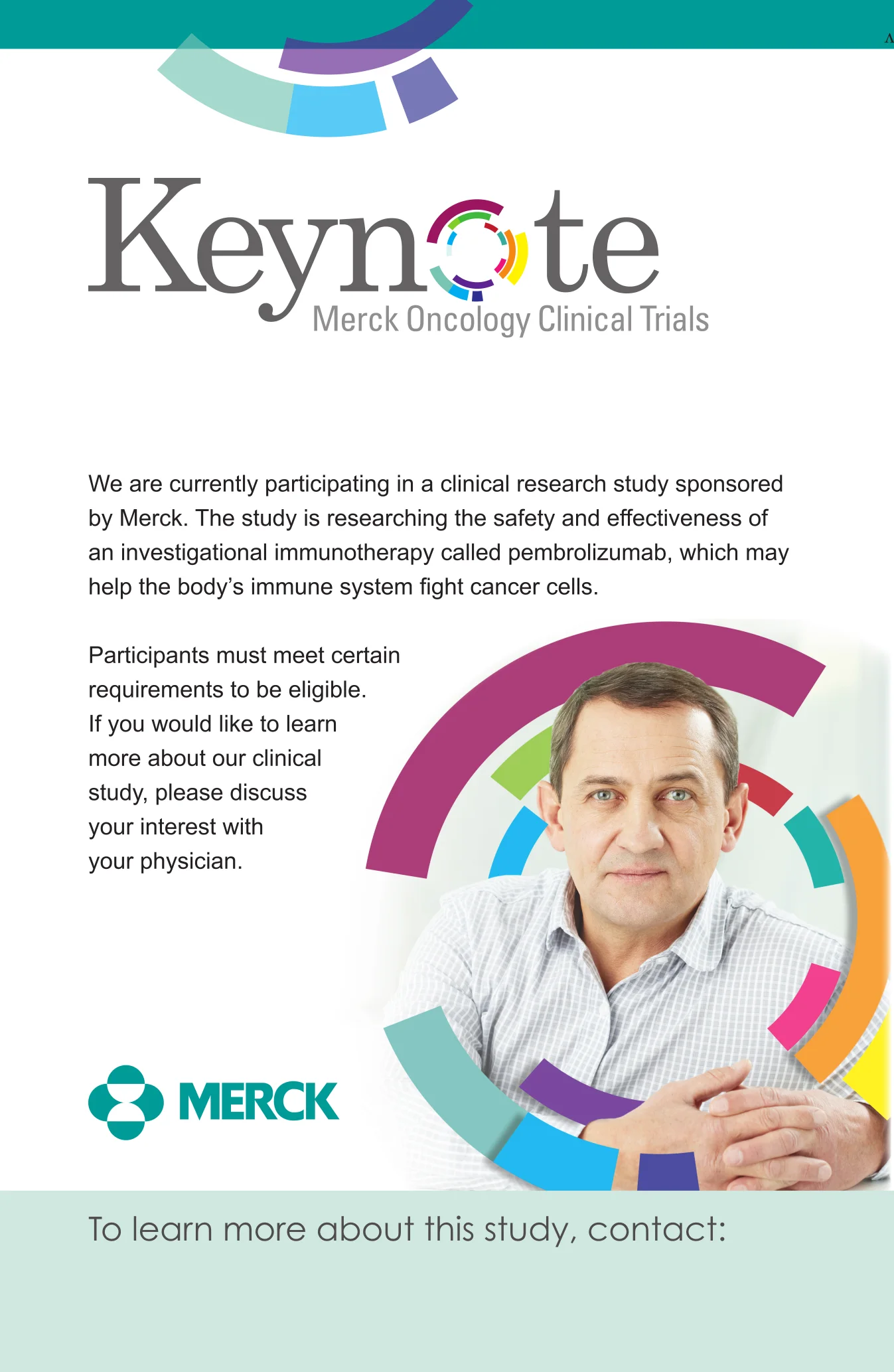
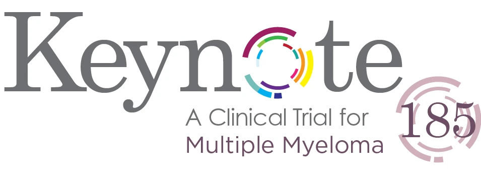
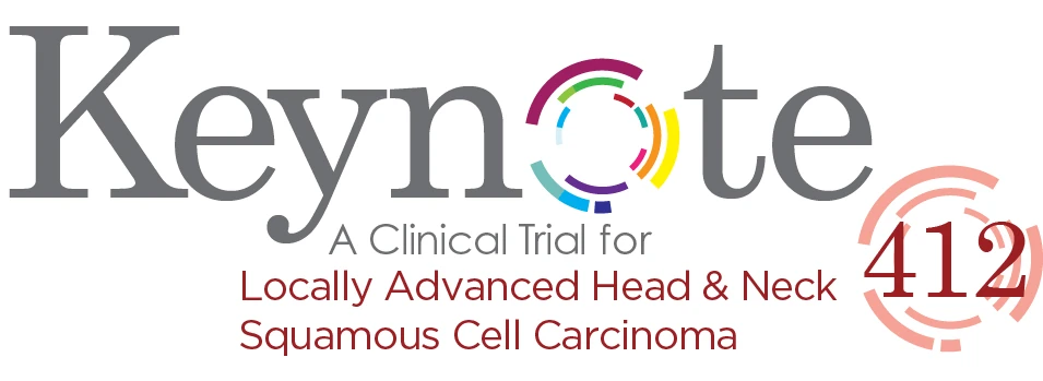
The idea started with a question: what if you had a cancer-fighting superpower? The “o” in Keynote became a ring of color, the patient’s own power to fight back. As the program grew, each arc took the color of a cancer under study, so one mark could hold the whole program.



The idea
The person at the center.
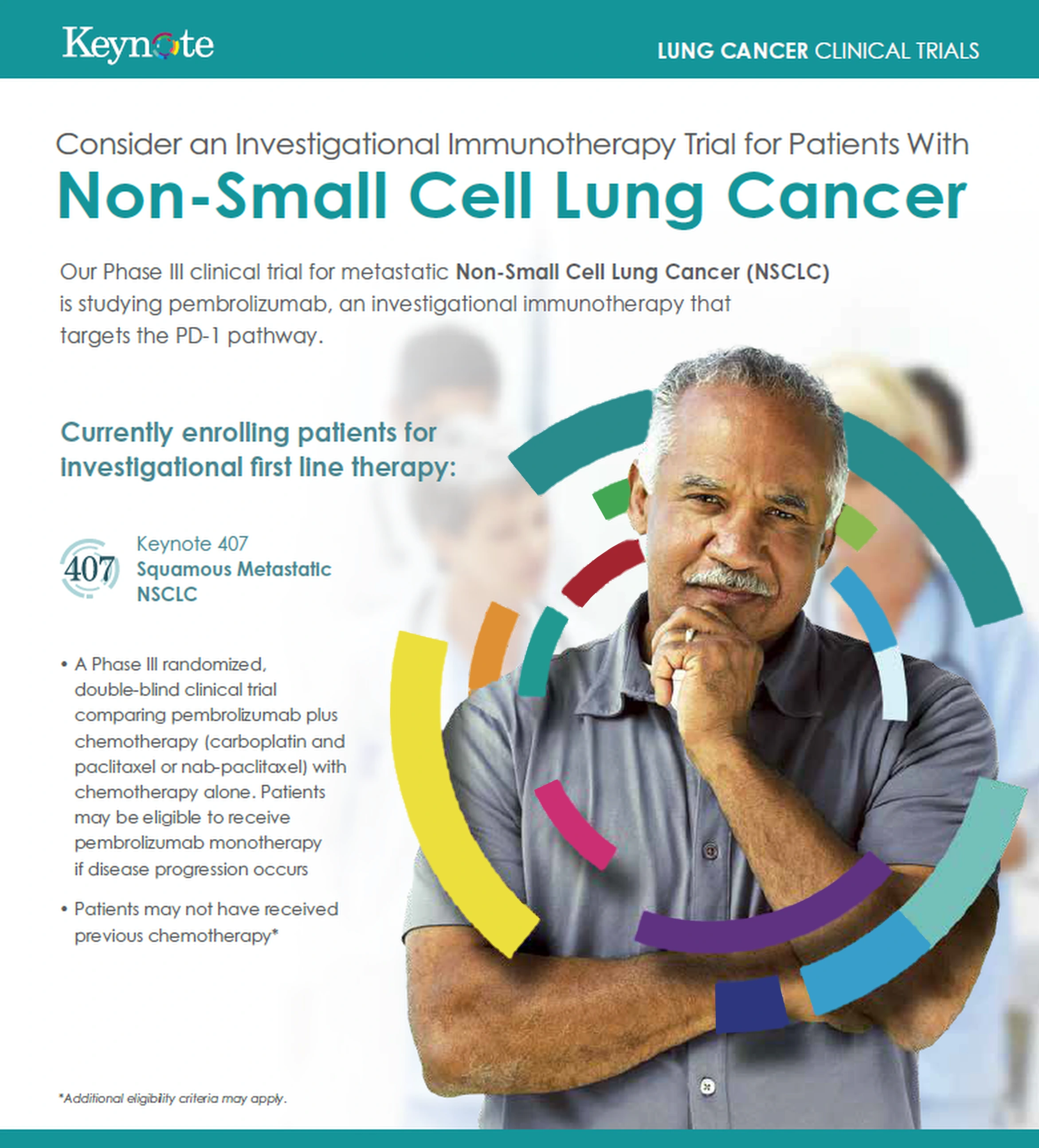
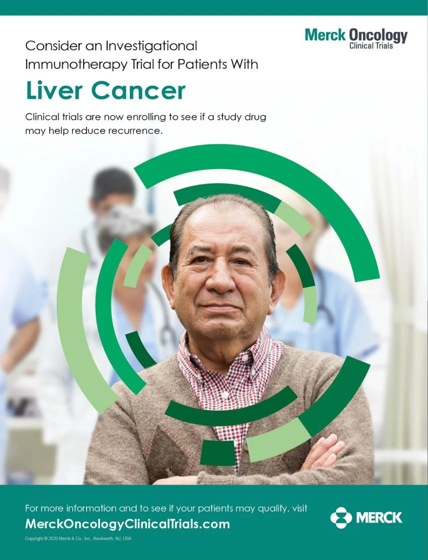
Immunotherapy helps the body’s own immune system fight cancer. So the rings don’t sit beside people. They surround them. In every image, the patient is at the center of the circle.
The system
From screen to waiting room.
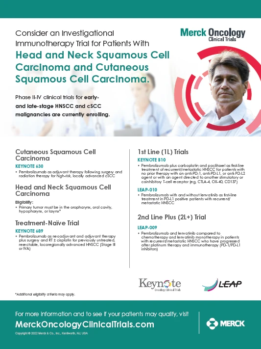
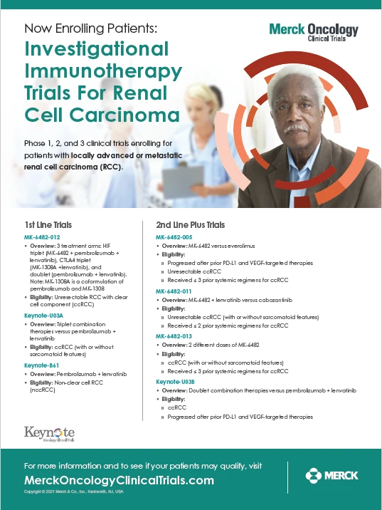
The same ring carried from the website into study site posters and physician flyers, always pointing patients toward a conversation with their physician.
What happened next
The ring outgrew the name.
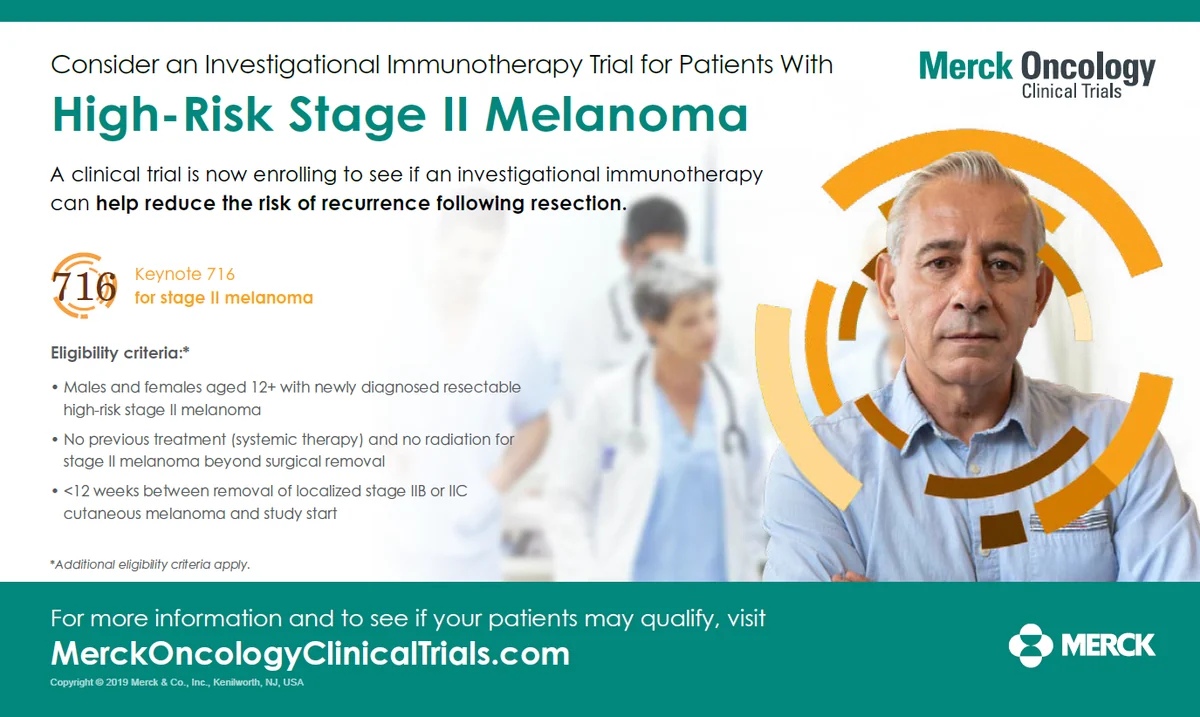
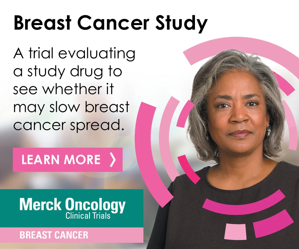
As the program grew, the ring became the visual system for Merck Oncology Clinical Trials. Each cancer took its own color, each study its own numbered mark, and every patient stayed at the center of the circle.
My role / Designed or directed the system as it scaled
The architecture
One ring, three levels.
Compound
Indication
Study



Breast
Head and neck
Hematology
Choose a color




The scale
Keynote was the trial program behind Keytruda, which became the world’s best-selling medicine. For years after, it was the bar every new piece of work was measured against. When the Keynote name was retired, the ring carried on as the identity for Merck Oncology Clinical Trials.
ClientMerck & Co., Inc.
AgencyContinuum Clinical
My roleLogo and website design; patient materials and the later system designed or directed