The story / 2026 / Reps & Recover / Independent
Reps & Recover
A brand for a physical therapist opening his own practice.
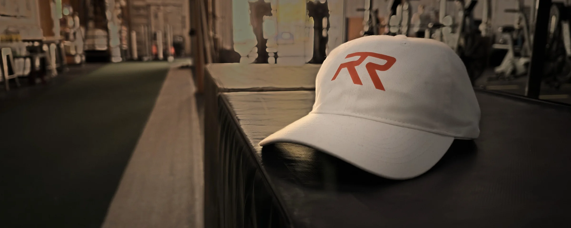
Sibu Varghese is a physical therapist and athletic trainer who opened his own practice in Northbrook, with one-on-one care for athletes and anyone serious about how they move. He needed a brand that looked as serious as his work.
Where it started
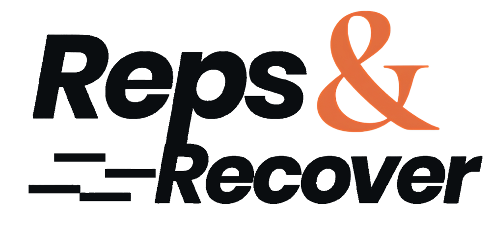
A name with energy.
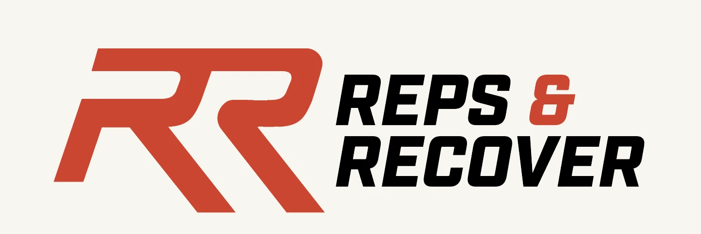
The original wordmark had the right spirit. The job was to turn a name into a mark, something that still works small, on a sleeve, a hat or a phone screen.
The mark
Two R’s, one motion.
Reps and recovery are two halves of the same cycle. So the two R’s share one forward lean, and the second picks up where the first leaves off. It reads as momentum, and it holds up on its own as an icon.
“It’s like you got in my head and pulled out exactly what I was trying to do on my own.”Sibu K. Varghese, DPT, PT, ATCFounder, Reps & Recover
At every size
Big or small, still an RR.
A mark for a practice lives on a wall and on a phone screen. The RR holds its shape cropped to fill a storefront window, and all the way down to a thumbnail.

The wordmark
Louder wasn’t better.
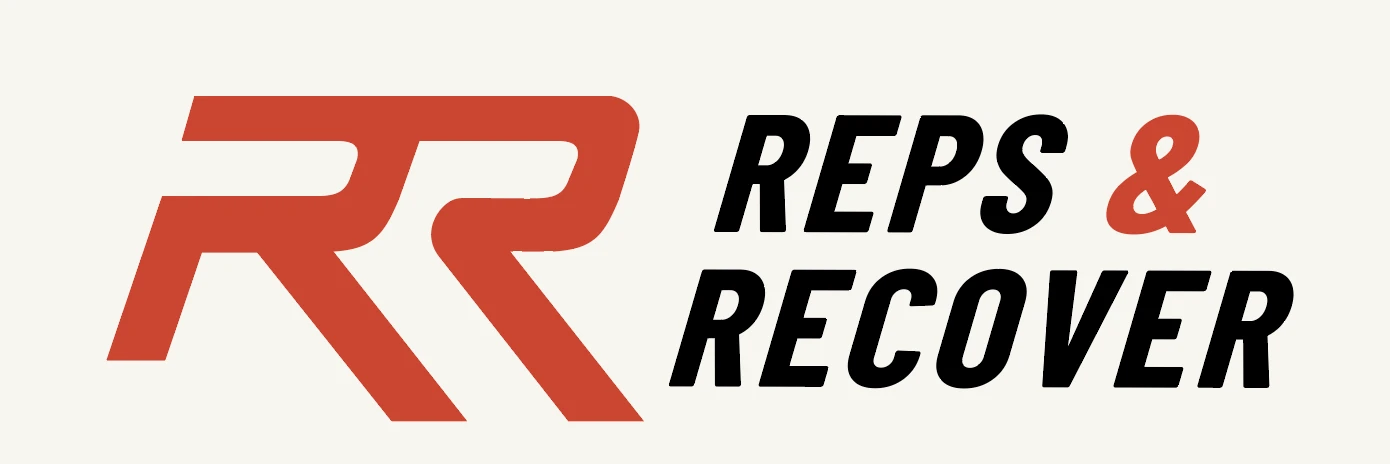
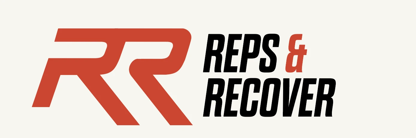
Early wordmarks pushed the name as hard as the monogram: italic, condensed, heavy. The final went the other way. A clean, steady sans lets the RR carry the motion, and reads as care as much as training.
In use
Strength meets recovery.
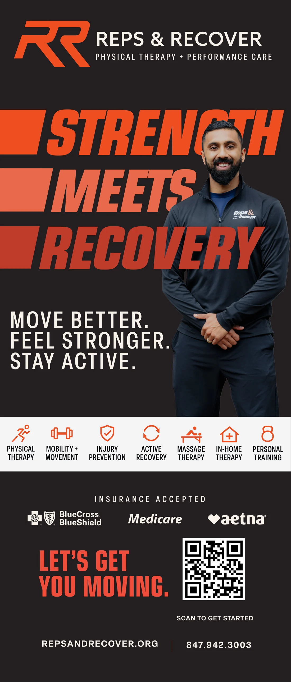
The first launch piece, a pop-up banner for the clinic and local events, puts the system to work: the mark up top, a loud headline in the brand’s red, and the services in plain language for people who just want to move better.
ClientReps & Recover, Northbrook, IL
ScopeMonogram, wordmark and launch banner
My roleDesigned by me